Table Of Contents
- How do you read trading charts?
- What are the key elements of trading charts?
- What are the most common technical indicators?
- What do chart patterns mean?
- How do you read charts across different markets?
- What are the practical steps to reading and using trading charts?
- How do you use technical analysis to forecast prices?
- What are the drawbacks of technical analysis?
- Conclusion
Learning How to Read Trading Charts
How to read FOREX, crypto, and stocks trading charts is one of the most important skills any retail trader can develop. Charts are the visual lifeblood of financial markets, helping traders interpret price action, spot trends, and make better-informed decisions in fast-moving markets.
The global financial markets are vast, liquid, and constantly changing, which makes it impossible to track every move in real time. That is why traders rely on charts, patterns, and indicators to turn raw price data into clear, actionable insight. In this article, our experts at Arincen explain the essentials of reading charts across different markets and help you understand chart patterns better.
Trading charts are universal tools used across assets like FOREX, crypto, and stocks to spot trends and time trades
Line, bar, and candlestick charts each show price movements differently, with candlesticks offering the richest detail
Key chart elements like time frames, volume, and OHLC prices help traders assess market sentiment and volatility
Indicators like moving averages, Bollinger Bands, and RSI help traders confirm trends and spot potential reversals
Chart patterns and trend lines are critical for finding entry and exit points and understanding market psychology
Reading charts varies by asset class, so traders must adapt their approach when analyzing FOREX, crypto, or stocks
Technical analysis relies on historical patterns, while fundamental analysis looks at an asset’s real-world value
Traders can improve results by combining indicators, practicing with demo accounts, and staying emotionally disciplined
How do you read trading charts?
You read trading charts by understanding how price moves over time using the same core formats across FOREX, crypto, and stocks. For retail traders, chart-reading skills are transferable between asset classes, so you do not need to learn a completely different system for each market. Core chart types such as line, bar, and candlestick charts all help reveal price movement and trend direction.
A chart can be boiled down to a simple graphical representation of information, powerfully aggregating the information of millions of trades over long stretches of time. As you gain experience, you can read charts much faster and place trades based on this information.
Price charts capture changes in supply and demand. These indicators capture how the market is behaving by aggregating and simplifying troves of information generated from purchases, sales, and price fluctuations. This information is represented in charts in a manner that is easy to understand if you take the time to learn about them.
There are several types of trading charts that traders commonly use, each offering a unique way to visualize and interpret market data.
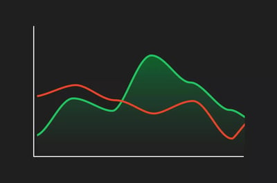
Line charts are perhaps the simplest form, displaying a continuous line that connects closing prices over a specified period. They are excellent for getting a quick, at-a-glance view of the overall trend, making them perfect for beginners or those who need a straightforward representation of price action without the clutter of additional data points.
Bar charts, on the other hand, provide a more comprehensive snapshot of price movements by including open, high, low, and close prices for each period. Each bar on the chart represents a single trading period, with the top of the bar indicating the highest price reached and the bottom the lowest.
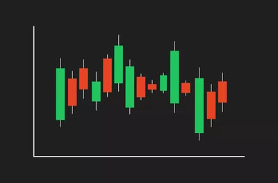
Candlestick charts are the go-to for many traders due to their rich, detailed depiction of market data. Each candlestick provides the same information as a bar chart — open, high, low, and close prices — but does so in a more visually intuitive format.
We’ve written a highly detailed article on Japanese Candlesticks.
What are the key elements of trading charts?
The key elements of trading charts are the price movements, the time frame, and the visual data that shows how the market changes over time. A chart maps price action across seconds, minutes, hours, or years so traders can interpret short-term and long-term behavior. These core elements provide the context needed to analyze trends and market activity.
Time frames
Time frames can range from as short as one minute to as long as months or years, and the chosen time frame can significantly influence your analysis and strategy. For instance, a 1-minute chart is ideal for scalpers, who thrive on making quick, small profits from minor price movements. It provides a granular view of market activity, allowing you to react swiftly to market changes. On the other hand, a 10-minute chart might be more suitable for day traders who seek to capitalize on price fluctuations throughout the trading day without holding positions overnight.
For those who prefer a broader view, daily and weekly charts offer a wider lens on market trends and are typically used by swing traders and investors. A daily chart consolidates price data into single-day intervals, making it easier to identify longer-term trends and key price levels, while a weekly chart can highlight overarching trends and price patterns that span months or even years.
Price levels
At the heart of trading charts are the key price levels of open, high, low, and close, often abbreviated as OHLC. These levels are essential for understanding market sentiment and analyzing price movements. The open price is the first price traded when the market opens for a specific time frame, setting the stage for the trading day or session. The high and low prices represent the maximum and minimum prices reached during the time frame, respectively, highlighting the range of price movements and the volatility of the market. The close price, perhaps the most crucial, is the final price at which the asset trades within the time frame, reflecting the market's consensus value at the end of the period.
These price levels are not just data points, but indicators of market psychology. For example, a higher closing price compared to the opening price generally signals bullish sentiment, indicating that buyers were more aggressive, driving prices up throughout the period. Conversely, a lower closing price suggests bearish sentiment, with sellers dominating the market. By analyzing these price levels, you can gauge the strength of trends, identify potential support and resistance levels, and make predictions about future price movements.
Volume
Volume is an important but often overlooked component of trading charts that measures the number of shares or contracts traded during a specific period. It is a key indicator of market activity and liquidity, providing context to price movements.
High volume indicates strong interest in a security, often coming with significant price movements and confirming the strength of trends. For instance, a price increase accompanied by high volume suggests robust buying interest and a solid bullish trend, whereas a price drop with high volume indicates strong selling pressure and a bearish trend.
Conversely, low volume can signal a lack of conviction among traders and might indicate that a price movement lacks momentum. It can also serve as a warning that a trend may be weakening or that a reversal could be imminent.
The different types of charts and how to read them
There are several types of trading charts, each offering a unique perspective on market data.
- Line charts display a continuous line that connects closing prices over a set period.
- Bar charts include the open, high, low, and close prices for each period, providing a more detailed view of price fluctuations within the market.
- Candlestick charts show the same data as bar charts but in a more digestible and visually intuitive way.
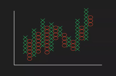
- Point and figure charts focus on price movements without considering time, which is particularly useful for identifying significant price trends and potential reversal points.
Line charts are the simplest, displaying a continuous line that connects closing prices over a set period. These charts are ideal for beginners or when you need a quick overview of the market’s general direction, making them easy to interpret at a glance.
In practice, one of the most common mistakes I see newer traders make is using a very short time frame for entries without checking the daily trend first, which often leads to trades that go against the broader market direction.
Join a Trading Community That Moves Together
Follow top traders and learn from real strategies.
Like, comment, and engage with other investors.
Discover experts through transparent performance data.
Connect with a community built on trust and results.
Grow your knowledge while trading smarter together.
.webp)
Bar charts add depth by showing the open, high, low, and close prices for each period, giving a clearer view of market fluctuations. The top of the bar represents the highest price reached during the period, while the bottom indicates the lowest, helping traders understand the range of market movements.
Candlestick charts are favored by many traders because they show the same data as bar charts in a more visually intuitive way. Each "candle" displays the open, high, low, and close prices, with the body of the candle showing the range between the open and close, and the wicks representing the high and low.
Lastly, point and figure charts focus on price movements without considering time, which is particularly useful for identifying significant price trends and potential reversal points. These charts use Xs for rising prices and Os for falling prices, making buy and sell signals easier to spot.
What are the most common technical indicators?
The most common technical indicators are tools traders use to interpret market movements across different financial asset classes. These indicators help turn price data into clearer trading signals and can be applied in multiple markets. While there are many available, a few have become especially popular because of how often traders rely on them.
Simple moving average line
Relative Strength Index (RSI)
Here is what you need to know about each type of indicator:
Simple moving average line
The simple moving average line says it all in the name. To make sense of this indicator, simply add up the closing prices of a set period and divide that number by the number of hours or days within that period.
For example, to work out the simple moving average for five days, total the closing prices for those five days and divide by five. Because charts present this information visually, you do not need to perform these calculations yourself. You simply need to observe the direction of the line to make sense of it.
Bollinger bands
Bollinger Bands show the measure of volatility in a market. When these bands are close together, known as a “squeeze formation,” it means that there are increased volatility and possible trading opportunities on the horizon. When these bands are wider apart, there is less volatility and less opportunity to make a winning trade.
Relative strength index (RSI)
The Relative Strength Index reveals the areas of the market that have been overbought and oversold. The measure starts from zero all the way to 100, with the lower readings showing a market that is oversold, and the higher readings showing a market that is overbought. An oversold market means many assets have been dumped onto the market, pointing to an absence of value. An overbought market means there are fewer opportunities left to buy anything meaningful. Clearly, by apportioning a number to these phenomena, it is much easier for traders to know where they stand.
What do chart patterns mean?
Chart patterns mean recurring formations that help traders identify trends and make more informed trading decisions. By learning to read these patterns, traders can assess how price and volume may develop based on historical behavior. This makes patterns a practical way to interpret likely market direction.
Trend lines
Trend lines are essential in technical analysis because they show the general direction of price movements and potential support and resistance levels. Drawing a trend line involves connecting a series of price points on a chart that show either an upward or downward trajectory. For an uptrend, you draw a line connecting the lows of the price movement, which serves as a support line. In a downtrend, you connect the highs, creating a resistance line. These lines represent psychological barriers where traders expect a reversal or continuation of the trend.
The significance of trend lines lies in their ability to highlight areas where the price has historically reacted. When the price approaches a trend line, it often finds support (in the case of an uptrend) or resistance (in a downtrend). Breaking through these lines can indicate a significant shift in market sentiment, potentially leading to new trends.
Support and resistance
Every financial asset has an implied value, so it is no surprise to learn that these values oscillate depending on market forces, like supply and demand, which are in turn driven by factors like sentiment and timing. The support level is a point at which an asset’s price is expected to stop falling after down trending for a period as a function of its plentiful supply.
After the price reaches a support level, meaning it has stopped falling, an increase in buyer demand normally pushes the asset value to rise. Resistance levels are reached when demand is in full swing and the value of the item appreciates until it is concentrated at the upper end, then traders start to sell. Over time, you can reliably predict the support and resistance levels of any asset through technical analysis. As you can imagine, it is extremely helpful when you can use this knowledge as the basis of a trading strategy. If used well and fed with quality information, support and resistance trading can be extremely powerful
Traders normally identify support and resistance levels in a few ways.
This information can help traders:
- Decide when to enter or exit a market.
- Determine where to insert stops and limits.
- Use historical price data to understand previous support and resistance levels.
- Apply technical tools in fast-moving markets like FOREX, where visual pattern study is less practical.
Another thing to keep an eye on is previous support and resistance levels. This simple method gives you a baseline to understand the behavior of the asset over time. As traders become more skilled, they often default to using technical indicators to isolate support and resistance levels as these technology-enabled signals are faster to generate and more reliable.
How do you read charts across different markets?
You read charts across different markets using the same basic formats, but you apply them differently depending on the asset. While chart structures remain similar, the context of FOREX, crypto, and stocks can change how traders interpret price action. That means the reading method is transferable, but the market-specific approach still matters.
FOREX charts
FOREX operates on currency pairs like EUR/USD or GBP/JPY, which means you're always trading one currency against another. This duality makes understanding how currencies interact crucial for successful trading. FOREX charts help you analyze these pairs and their price movements in real-time, influenced by a multitude of factors ranging from interest rate changes to political instability.
As a FOREX trader, you’ll find that these charts are your gateway to gauging market sentiment and predicting economic trends. For example, a sudden spike in the USD/EUR chart could indicate a significant economic event, like a change in the US Federal Reserve’s interest rate policy, impacting the dollar's value against the euro. By interpreting these movements, you can make informed decisions about what is the best time to enter trades based on economic forecasts and geopolitical developments.
Crypto charts
Reading crypto charts offers a different set of challenges and opportunities compared to FOREX or stocks. The crypto market is known for its high volatility and 24/7 trading cycle, meaning that prices can swing dramatically at any time of the day or night. This constant activity is both a boon and a bane for traders like you—it offers endless opportunities but requires vigilance and quick decision-making.
Crypto charts are invaluable for tracking these rapid price changes and understanding the underlying sentiment driving them. In the crypto world, market sentiment can be heavily influenced by technological developments, regulatory news, and even social media trends.
For instance, a positive tweet from a tech influencer can cause a surge in Bitcoin prices, as reflected on your charts. Additionally, new technology updates or forks can lead to significant shifts in value. By monitoring crypto charts closely, you can spot trends, forecast price movements, and adapt to the changing digital currency market.
Stock charts
When it comes to stock charts, you're looking at a treasure trove of data that reflects the performance of individual companies and the broader economy. Unlike FOREX or crypto, stock trading revolves around companies and their financial health. Key indicators like earnings reports, dividends, and economic factors play a significant role in shaping stock prices.
Stock charts help you track how a company’s stock price has moved over time and how it's likely to move in the future. For example, if a company reports better-than-expected quarterly earnings, you might see a sharp uptick in its stock price on the chart. Similarly, announcements of dividends can signal financial health and attract more investors, which can drive up the price.
By analyzing stock charts, you can assess the impact of various factors on a company's performance and make informed trading decisions. Understanding these charts allows you to identify trends, gauge investor sentiment, and capitalize on potential investment opportunities.
What are the practical steps to reading and using trading charts?
The practical steps to reading and using trading charts begin by starting with the basics. Traders should first build a clear understanding of how charts display price movement before applying more advanced techniques. This creates a stronger foundation for using charts effectively in real trading decisions.
When you’re just beginning with trading charts, it’s crucial to keep things simple and build your foundation on the basics. Begin with the most straightforward charts, like line charts, which plot closing prices over time and give you a clear view of the general direction of a market.
These charts are perfect for getting a feel for how prices move without being overwhelmed by too much data. From there, you can move on to bar charts, which provide more detail by showing opening and closing prices as well as the highs and lows for each period.
Candlestick charts are another step up, offering a detailed look at price action that can help you understand market sentiment at a glance. Stick to basic indicators like moving averages and RSI initially, as they are easy to understand and can provide valuable insights into trends and momentum.
Combine multiple indicators
As you become more comfortable with the basics, it's time to enhance your analysis by combining multiple indicators. No single indicator can provide a complete picture of the market, so using a combination can give you a more comprehensive view.
For example, you might pair moving averages with the RSI to confirm trends and identify potential entry or exit points. Moving averages can help you spot the overall trend direction, while the RSI can alert you to overbought or oversold conditions.
Adding Bollinger Bands into the mix can further help you understand market volatility and potential price reversals. By using multiple indicators together, you can cross-verify signals and reduce the likelihood of making decisions based on false trends.
In chart reviews and strategy testing, combinations tend to work best when each indicator has a distinct role, for example, one for trend direction, one for momentum, and one for volatility. Using several indicators that all measure nearly the same thing can make analysis look more precise than it really is, without improving decision-making.
Practice and continuous learning
The more you practice reading and analyzing charts, the better you’ll become at spotting trends, patterns, and potential trading opportunities. Start by using demo accounts to apply what you’ve learned in a risk-free environment.
Stay updated with market trends and technological advancements, as the financial markets are constantly evolving. Subscribe to financial news, follow market analysis, and engage with a trading community like Arincen to keep your knowledge current. The markets are dynamic, and staying informed about the latest trends and tools can give you a significant edge.
How do you use technical analysis to forecast prices?
You use Technical analysis to forecast prices by studying charts, indicators, and past market behavior to anticipate future price movements. Traders do this by analyzing chart patterns from previous trading activity and looking for signals that may point to likely outcomes. In general, the process combines historical price charts with technical indicators to identify potential trading opportunities.
Traders use one or more of the three charts I've mentioned—line, bar, and candlestick—and augment their analysis with other information, such as tracking moving averages or monitoring Bollinger Bands for volatility. Without this information, a trader is operating blindly. The focus of the research is to identify price points for entering and exiting trades.
Not all charts or indicators are used by all traders. Like everything in life, people develop different preferences depending on their trading style, the market they trade, and the timeframe in which they want to generate profits.
Technical analysis is especially useful in demo accounts, where traders can test and refine strategies before committing real capital. By formulating strategies and testing strategies in a risk-free environment, traders can fine-tune their tactics to see if they can make money. One specific method of testing a strategy involves using actual historical price movements to simulate whether a strategy would have worked, and in my own strategy reviews, this process is often most useful when tested across multiple market conditions, not just one favorable trend. This is known as backtesting, and it is a powerful way to assess the viability of a strategy. If backtesting is successful in a demo environment, then traders have the confidence to try it in the real world.
A normal follow-up action from backtesting is for traders to automate their winning strategies. Why take the time and effort to manually input trade details every time? Traders are much more productive and efficient when they can automate the trading strategies they believe will work. Once algorithms are put in place, they can run a trader’s portfolio with unerring accuracy. Of course, the trader cannot completely ignore their portfolio from this stage, as they still need to keep an eye on how their automated strategies are performing.
Technical analysis vs fundamental analysis
In my view, it’s worth making a distinction between technical analysis and another type of analysis—fundamental analysis. This analysis involves a trader investigating the overall viability of a financial asset. When you think of a volatile asset like cryptocurrency, it is a valid question to ask whether it is worth entering the market at all. On the other hand, entering an established market like commodities, which includes oil and energy products that drive the world, is a no-brainer.
However, it goes deeper than simply examining the viability of an asset. Fundamental analysis also involves assessing whether an asset is priced correctly and represents fair value. Think of buying a used car. You probably have an instinct about what represents fair value for the vehicle. If it is priced too high, you can find a better offer; if it is priced too low, something is probably wrong.
Technical analysis, as I've mentioned, focuses on examining historical trends and price movements to identify opportunities to profit at a given moment. Technical analysis will not help you figure out if the assets you are buying are in an unsustainable bubble, whereas fundamental analysis can.
Important assumptions of technical analysis
Technical analysis relies heavily on the idea that charts and indicators give bankable information of where an asset stands in relation to its verifiable history. Users of technical analysis operate under the principle that markets follow recurring cycles of behavior that can be studied and exploited.
Many trading experts would advise combining fundamental analysis with technical analysis. It is a matter of perspective. Where fundamental analysis steps back to examine the value of an asset in a broader context, technical analysis focuses on the asset’s behavior over a specified period, ignoring external factors.
How is technical analysis used?
In my experience, trading charts are the bedrock of technical analysis, which can be deployed in both short-term and long-term trading like day trading and swing trading respectively. This means that both short-term scalpers and long-term swing traders use technical analysis. Swing traders target slow-moving swings that can often take months to play out. They make decisions and hold firm because their technical analysis tells them they will be vindicated in the end.
Scalpers or day traders use technical analysis to uncover quick opportunities for profit. Technical analysis is applicable across most markets, such as FOREX, stocks, and commodities. Online brokers might compete in a lot of areas, such as price and platform strength, but traders are just as keenly checking the quality of a broker’s technical analysis tools.
What are the drawbacks of technical analysis?
The main drawbacks of technical analysis are that it has limitations despite being a widely used trading method. Even when traders rely on it regularly, it does not guarantee accurate forecasts in every market condition. Understanding these limits helps set more realistic expectations when using chart-based analysis.
- Analysis can be subjective: two traders can view the same chart and interpret it differently, which could lead to markedly different trades being placed.
- It can be a closed loop: a feature of trend psychology, if enough people act in the same way, the results of each trader’s actions become less effective.
- The data is not always accurate: technical analysis draws its information from data prepared and processed by third-party-coded trading platforms, and data may be delayed or incorrect.
- It ignores some fundamental information: focusing solely on technical analysis can be a mistake because it provides only a limited view of the market.
- Relying too heavily on a single indicator: no single tool can capture the full complexity of the market, and depending on one can cause traders to miss other crucial signals and trends.
It can be a closed loop: a feature of trend psychology, if enough people act in the same way, the results of each trader’s actions become less effective. This is why some markets become overtraded or undertraded when traders get the same information and place the same trades.
The data is not always accurate: Technical analysis draws its information from data prepared and processed by third-party-coded trading platforms. Data may be delayed or incorrect, leading traders to act on bad information.
It ignores some fundamental information: if you do not consider other factors that could move a market, focusing solely on technical analysis could be a mistake, as it provides only a limited view of the market.
Relying too heavily on a single indicator: While a moving average or RSI can offer useful signals, overdependence on one tool can create blind spots in your analysis. Relying solely on one indicator can lead to tunnel vision, leaving you to miss other crucial signals and trends.
Emotional trading: An emotional trader is an inefficient trader. There is a certain irony in the fact that it is the joy of making profits that brings traders to the table; yet, to be successful, they must keep a lid on their emotions. It is a common misconception that traders act on instinct and emotion, and that they only go by their gut feeling when making trades. To be a successful trader, you must be rational, calculated, and consistent.
Some of the best advice regarding risk-management techniques involves curbing your enthusiasm and not risking too much of your portfolio at once. You need to understand what you are going to do in a calculated way and stick to your plans.
Conclusion
How to read FOREX, crypto, and stocks trading charts comes down to mastering the basics, choosing the right combination of charts and indicators, and building confidence through consistent practice. The more familiar you become with chart behavior, technical analysis, and market context, the better your trading decisions will be.
Success does not happen overnight. It takes practice and dedication to turn chart reading into a real advantage, so start small, stay disciplined, and use a demo account before risking real money. Learn steadily, test your approach, and let experience shape your strategy.
FAQ
The main chart types are line, bar, candlestick, and point and figure charts. Line charts are the simplest, while bar and candlestick charts show OHLC data in more detail.
Understanding trading charts equips you with the ability to analyze historical price movements and forecast future trends. This skill helps make informed trading decisions across various assets.
Time frames on trading charts, ranging from minutes to years, affect how price movements are interpreted. For example, short-term charts are ideal for quick trades, while long-term charts help identify broader market trends, essential for effective trading strategies.
Price levels such as open, high, low, and close provide insights into market sentiment and price volatility. These levels help traders identify trends, support, and resistance zones, and make predictions about future price movements.
Volume indicates the number of trades executed over a specific period and highlights market activity and liquidity. High volume typically confirms strong price movements, while low volume can suggest a lack of interest and potential trend reversals.
While the underlying assets differ, the basic principles of reading trading charts are the same across FOREX, crypto, and stocks. The skills learned in chart analysis are transferable and applicable to various markets, providing a versatile toolset for traders.
Combining multiple indicators like moving averages, RSI, and Bollinger Bands provides a more comprehensive view of market trends. This approach helps cross-verify signals and reduces the risk of making decisions based on incomplete information, enhancing trading accuracy.
Avoid over-relying on a single indicator, ignoring fundamental analysis, and letting emotions drive trading decisions. Diversifying your analysis methods and maintaining a rational approach can lead to more effective and profitable trading strategies.
Start by identifying the time frame, then read the price action using open, high, low, and close. After that, check trend direction, key support and resistance levels, volume, and any indicators you use.
Time frames change how price movement looks and how you interpret it. Shorter charts suit scalpers and day traders, while daily and weekly charts are better for spotting broader trends and swing opportunities.
OHLC stands for open, high, low, and close. These four prices show how the market moved during a period and help traders judge sentiment, volatility, trend strength, and possible turning points.
Volume shows how much trading activity happened during a period. High volume can confirm a strong move, while low volume may suggest weak conviction, fading momentum, or a possible reversal.
Support is a price area where a falling market may pause or bounce, while resistance is where a rising market may stall. These levels help traders plan entries, exits, stops, and profit targets.
Beginners often start with moving averages, RSI, and Bollinger Bands. Together, they help you track trend direction, spot overbought or oversold conditions, and understand whether volatility is expanding or contracting.
Yes, the basic chart-reading principles are transferable across all three markets. The difference is in what drives price, such as macro events in forex, sentiment in crypto, or company performance in stocks.
Not always. Technical analysis is useful for timing trades and reading market behavior, but it can miss bigger issues like valuation, earnings, regulation, or macroeconomic shifts that also move prices.
Avoid relying on one indicator, ignoring fundamentals, using the wrong time frame, and trading emotionally. It also helps to practice on a demo account first instead of risking money while still learning.