Table Of Contents
- What are Chart Patterns?
- Chart Patterns Listed
- The Major Chart Patterns
- The Lesser Charts
- Do Chart Patterns Really Work?
- How Can I Use Chart Patterns in Technical Analysis?
- Why Do Chart Patterns Work?
- What are False and Failed Breakouts?
- Which Timeframe is Best to Use Trading Chart Patterns?
- Conclusion
The Ultimate Guide to 22 Chart Patterns Every Trader Must Know
In my view, stock trading chart patterns are crucial for traders, offering visual representations of price movements that indicate potential market trends. As a trader, you may have heard the names of many charts, but perhaps you haven’t always understood how they fit together.
Understanding these patterns can help you make informed trading decisions and identify when to buy, sell, or hold your positions. In this ultimate guide, written by me in my capacity as an Arincen expert, we’ll explore some of the most vital chart patterns and offer detailed strategies, including price action, buy/sell signals, stop loss, and take-profit levels. For all the major patterns, we’ll include a live example to explain each, helping solidify the concepts. As always, I emphasize that this article is not financial advice, and past performance does not guarantee future performance.
Chart patterns such as head and shoulders, double tops and bottoms, triangles, flags, and wedges visually capture repeated market behaviors and help forecast future price moves
Head and shoulders and inverse head and shoulders predict trend reversals by highlighting shifts in market peaks and troughs
Double tops and double bottoms signal major reversals when price tests and fails key levels twice
Triangle patterns, ascending, descending, and symmetrical, reflect consolidations that often resolve with breakouts in the direction of the prior trend
Flags and pennants form after sharp price moves and signal continuation, offering low-risk breakout opportunities upon pattern completion
Wedges, whether rising or falling, often indicate reversal patterns when they appear after prolonged trends
Volume confirmation, such as decreasing volume during consolidation and increasing volume on breakout, strengthens pattern reliability
Effective use of chart patterns involves setting entry points close to breakout zones, placing stop-loss orders just outside patterns, and combining patterns with tools like trend lines, moving averages, and oscillators
What are Chart Patterns?
From my experience, chart patterns are visual formations on stock-price charts that help traders like you predict future price movements based on historical market behavior. These patterns are created by the fluctuating price of a security over time, reflecting the balance between supply and demand.
Chart patterns provide insight into the psychology of market participants, often indicating whether buyers (bulls) or sellers (bears) are in control. By identifying these formations, you can anticipate market trends, reversals, or continuations, empowering you to make informed decisions about when to enter or exit trades. Popular patterns like the Head and Shoulders, Double Tops, and Wedges offer valuable signals for traders to capitalize on potential opportunities while managing risk effectively.
Trading chart patterns are most useful in technical analysis for identifying potential market trends and making informed trading decisions. They help you recognize the likelihood of continuation or reversal in the price movement of financial assets, such as stocks, commodities, FOREX, or cryptocurrencies.
By analyzing these patterns, you can identify buy or sell signals, determine entry and exit points, and set stop-loss and take-profit levels to manage risk.
Chart patterns are especially valuable in markets driven by investor sentiment, where historical price action tends to repeat itself due to psychological factors. This makes them particularly effective in highly liquid markets with significant trading volume, such as stock and FOREX markets, where patterns are more likely to play out as expected.
Chart Patterns Listed
For your reference, here’s a list of all the chart patterns mentioned in the article in one helpful table:
| Chart Pattern | When to take profit | When to Buy/Sell | Action | When to stop loss |
| Head and shoulders | Measure the distance between head and neckline and project downward | Sell when price breaks below the neckline | Bearish | Place above the right shoulder |
| Double top | Measure the distance between peaks and neckline and project downward | Sell when price breaks below the neckline | Bearish | Place above the second peak |
| Double bottom | Measure the distance between bottoms and neckline and project upward | Buy when price breaks above the neckline | Bullish | Place below the second bottom |
| Rounding bottom | Measure the distance between the lowest point and resistance, project upward | Buy when price breaks above resistance | Bullish | Place below the lowest point |
| Cup and handle | Measure the distance between the bottom of the cup and resistance, project upward | Buy when price breaks above the handle | Bullish | Place below the handle |
| Pennant | Measure the height of the flagpole and project it from breakout | Buy on bullish breakout; Sell on bearish breakout | Continuation | Below lower trendline for bullish, above upper for bearish |
| Flag | Measure the height of the flagpole and project it from breakout | Buy on bullish breakout; Sell on bearish breakout | Continuation | Below lower trendline for bullish, above upper for bearish |
| Bearish wedge | Measure the height of the wedge and project downward | Sell when price breaks below the lower trendline | Bearish | Above the upper trendline |
| Bullish wedge | Measure the height of the wedge and project upward | Buy when price breaks above the upper trendline | Bullish | Below the lowest point |
| Ascending triangle | Measure the height of the triangle and project upward from breakout | Buy when price breaks above the resistance line | Bullish | Place below the upward-sloping trendline |
| Ascending triangle bullish continuation | Measure the height of the triangle at its widest point and project this distance upward from the breakout point | Buy when the price breaks above the resistance line | Bullish | Place the stop loss below the upward-sloping trendline |
| Descending triangle bearish continuation | Measure the height of the triangle and project downward from breakout | Sell when price breaks below the support line | Bearish | Place above the downward- sloping trendline |
| Symmetrical triangle | Measure the height of the triangle and project in the direction of breakout | Buy on breakout above resistance; Sell on breakout below support | Neutral | Just outside the opposite side of breakout |
| Symmetrical triangle neutral continuation | Measure the height of the triangle at its widest point and project this distance in the direction of the breakout | Buy when the price breaks above the resistance trendline. Sell when the price breaks below the support trendline | Neutral | Place the stop loss just outside the opposite side of the triangle from the breakout point |
The Major Chart Patterns
The following is a list of the major patterns you can expect to encounter as a trader. The bulk of your technical analysis will be done using these patterns. Later in the article, we’ll introduce you to some of the lesser patterns that you may encounter less frequently, but are good to know all the same.
1. Head and Shoulders Pattern
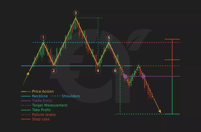
In my view, the Head and Shoulders is one of the most important patterns for the average investor because it is one of the most reliable reversal patterns. This signals a shift from a bullish to a bearish trend. What does it look like? The Head and Shoulders is made up of three peaks: a higher peak (the head) between two lower peaks (the shoulders).
Why should you know this pattern? Understanding this pattern helps you recognize when a bullish trend is losing momentum, and a bearish reversal may be on the way. Think about it, if you are a new investor, wouldn’t being able to identify this pattern prevent you from potential losses by signaling when to exit long positions or consider short positions? Let’s look at the pattern in closer detail:
Left Shoulder: The price rises to a peak and then declines.
Head: The price rises again to a higher peak than the left shoulder and then declines.
Right Shoulder: The price rises again, but to a lower peak, forming the right shoulder, followed by a decline.
You should know that a key element in this pattern is the neckline, which connects the lows after each shoulder and the head. Once the price breaks below this neckline, it confirms the pattern and signals a bearish reversal.
Price Action
The Head and Shoulders pattern suggests that buyers are losing control of the market and sellers are starting to gain strength. First, bulls push the price to the head, but the right shoulder shows weakening buying power, leading to a potential decline. This dynamic should give you some good clues about what to do next.
When to Buy/Sell
Sell Signal: The sell signal is triggered when the price breaks below the neckline. You can usually identify the neckline breakdown when you see an increase in volume, confirming the reversal.
Buy Signal: Some traders may attempt to buy when the price initially hits the neckline (without breaking), expecting a short-term bounce. However, this is a riskier trade. You might wonder why they would do this: well, it’s because these traders are betting on a short-term bounce when the price temporarily rebounds off the neckline support level before the potential breakdown. Traders who buy at this point believe that the support provided by the neckline will hold, at least for a brief period, allowing them to capture a quick profit from the rebound.
These risk-management mechanisms are so important to traders, but when should you use them in the context of the Head and Shoulders pattern?
Stop Loss: Place the stop loss above the right shoulder. This ensures you limit your losses if the price moves against you, as a break above the right shoulder erases the pattern.
Take Profit: The take profit target is mostly calculated by measuring the distance between the head and the neckline, then projecting that distance downward from the point of the neckline break. How do I do this? First, measure the distance from the highest point of the head (the peak) to the neckline (the support line). Then, after the price breaks below the neckline, you take that same distance and project it downward from the neckline to set your take profit level.
Live Example
Imagine you had a stock called Widgets Inc. Consider the following example from Widgets Inc. stock:
The price of Widgets Inc. formed a Head and Shoulders pattern, with the left shoulder at $50, the head at $55, and the right shoulder at $52.
The neckline connected lows at $47. You entered short positions once the price broke below $47 (the neckline), setting a stop loss above the right shoulder at $52.
The distance between the head and neckline is $8 ($55 - $47), so the take profit was set at $39 ($47 - $8).
By successfully entering a short position when Widgets Inc. broke below the $47 neckline and holding until the price reached the $39 take profit target, you would have capitalized on the clear reversal signal and locked in juicy gains from the precise execution of the Head and Shoulders strategy!
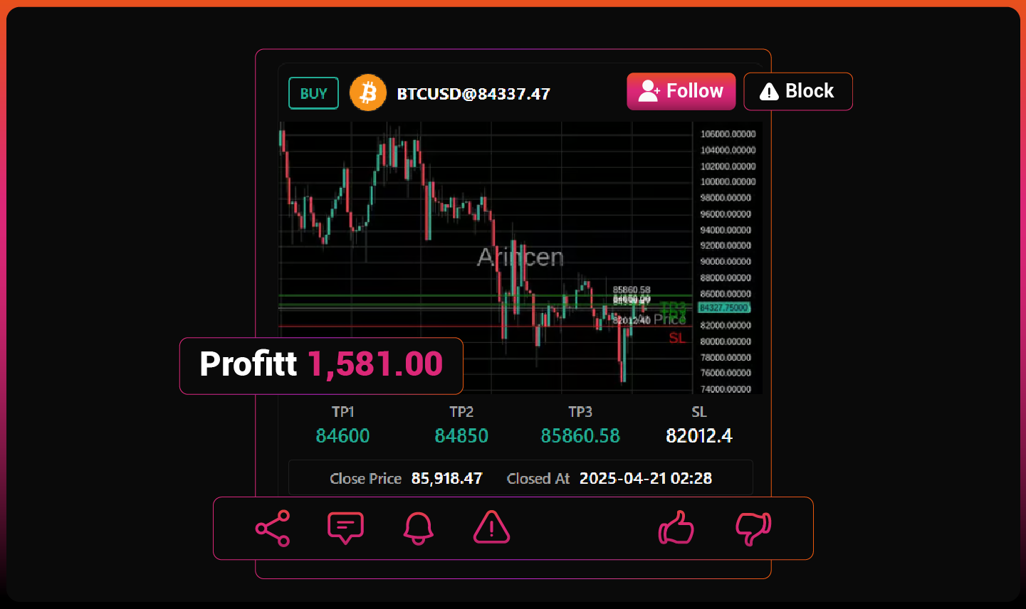
Trade with Real-Time Expert Signals
Follow live signals from experienced traders.
Get entry price, TP levels, SL, and closure updates.
Receive instant alerts when targets or stops are hit.
Track performance with clear, transparent stats.
Stay aligned with the market in real time.
2. Double Top Pattern
The next important chart I will discuss is the Double Top pattern. It is one of the most significant patterns for any new investor because it is a highly reliable reversal pattern. What is a reversal pattern? This is a situation that reveals a potential change in the direction of an asset's price trend.
When a reversal pattern forms, it suggests that the current trend—whether upward (bullish) or downward (bearish)—is losing momentum and may reverse, leading to a new trend in the opposite direction. What does it look like? In our case, the Double Top is made up of two peaks that occur at roughly the same price level, with a decline in between them. It looks like the shape of the letter "M."
Why is this pattern so important to know? Recognizing the Double Top can help you see when a bullish trend is losing steam, and a reversal to the downside is approaching. If you're new to investing, identifying this pattern can stop you from losing money by signaling when to exit long positions or consider short ones. Let’s break it down in more detail:First Peak: The price rises to a peak, then pulls back.Second Peak: The price rises again but fails to break through the same level as the first peak, then declines.The neckline connects the lowest points between the two peaks. Once the price breaks below this neckline, it confirms the pattern and signals a bearish reversal. Look at the image to get a good view of how it looks.
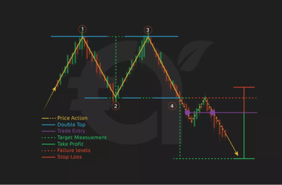
Price ActionThe Double Top pattern shows that buyers have tried twice to push prices higher but failed. The fact that they’ve failed to pass the first peak shows weakening buying momentum and the growing influence of sellers. Once the price breaks below the neckline, it’s probably the case that sellers are now in control, which could lead to a further decline.
When to Buy/SellSell Signal: Try to sell when the price breaks below the neckline, confirming the bearish reversal. Increased volume often comes with the neckline breakdown, further confirming the trend change.Buy Signal: Some traders tend to buy when the price first pulls back to the neckline (without breaking), hoping for a short-term bounce. Note that this is a riskier trade, as it relies on the neckline acting as support in the short term before the pattern fully plays out.
Stop Loss & Take ProfitWhen trading the Double Top, remember that stop loss and take profit levels are important for managing risk.Stop Loss: Place the stop loss just above the second peak. This protects against unexpected upward movement, as a break above the second peak erases the pattern.Take Profit: You can calculate the take profit target by measuring the distance from the peaks to the neckline and projecting that distance downward from the point of the neckline break. To calculate this, measure the distance between the highest point of the peaks and the neckline, then apply that same distance below the neckline to determine where to take profit.
Live ExampleLet’s use a fictional stock called Gadgets Inc. as an example:
The price of Gadgets Inc. formed a Double Top, with the first peak at $70 and the second peak at $69. The neckline connected lows at $60. You entered a short position when the price broke below $60 (the neckline), setting a stop loss above the second peak at $69.The distance between the peaks and the neckline is $10 ($70 - $60), so the take profit was set at $50 ($60 - $10).
By entering a short position when Gadgets Inc. broke below the neckline and holding until it reached the $50 take profit level, you would have captured a healthy profit from recognizing the clear bearish reversal signaled by the Double Top pattern!
3. Double Bottom Pattern
The Double Bottom is one of the most crucial patterns for any new investor to learn because it is a reliable bullish reversal pattern. This means it signals a shift from a bearish trend to a bullish one, marking a potential opportunity for gains.
What does it look like? The Double Bottom consists of two troughs (or lows) occurring at roughly the same price level, with a rise in between them. It looks like the letter "W."
Why is it important for investors to know this pattern? Recognizing the Double Bottom helps you identify when a bearish trend is losing momentum, and a reversal to the upside could be underway. For new you, being able to spot this pattern can signal when it’s time to consider long positions, capitalizing on the reversal before an uptrend begins. Let’s break down the pattern: First Bottom: The price falls to a low and then rises.Second Bottom: The price declines again but doesn’t fall below the first bottom, indicating weakening selling pressure.The neckline connects the highest points between the two bottoms. Once the price breaks above this neckline, it confirms the Double Bottom pattern, signaling a bullish reversal.
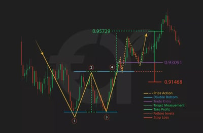
Price ActionThe Double Bottom pattern shows that sellers have tried twice to push prices lower but have failed both times, indicating that selling momentum is weakening. The failure to make a new low signals the increasing strength of buyers. When the price breaks above the neckline, it suggests that buyers are now in control, likely leading to further upward movement.
When to Buy/SellBuy Signal: The buy signal is triggered when the price breaks above the neckline, confirming the bullish reversal. The breakout is often accompanied by increased volume, validating the trend change.
A quick note on the term breakout: You’ll hear about it a lot in this article. It’s when an asset price moves beyond a defined level of support or resistance with increased volume. This movement indicates a potential change in market sentiment and often signals the beginning of a new trend.
Sell Signal: Some traders might attempt to sell when the price approaches the neckline (without breaking it), expecting a short-term pullback. Be warned that this is a riskier trade, as it assumes the neckline will act as resistance in the short term.
Stop Loss & Take ProfitSetting stop loss and take profit levels is critical when trading the Double Bottom pattern.Stop Loss: Place the stop loss just below the second bottom. This limits potential losses in case the price unexpectedly falls and erases the pattern.Take Profit: The take profit target is calculated by measuring the distance between the lowest point of the bottoms and the neckline, then projecting that distance upward from the neckline. To do this, measure the distance between the lowest point of the bottoms and the neckline, and apply that distance above the neckline to find where to take profit.
Live ExampleConsider the stock Widgets Inc. for a Double Bottom pattern:
The price of Widgets Inc. formed a Double Bottom, with the first bottom at $40 and the second bottom at $41. The neckline connected highs at $50. You entered a long position when the price broke above $50 (the neckline), setting a stop loss below the second bottom at $40.The distance between the bottoms and the neckline is $10 ($50 - $40), so the take profit was set at $60 ($50 + $10).
By entering a long position when Widgets Inc. broke above the neckline and holding until the price reached the $60 take profit target, you would have cashed in on the clear bullish reversal signaled by the Double Bottom pattern!
4. Rounding Bottom Pattern
The Rounding Bottom is a key pattern for you to understand because it signals a bullish reversal and can lead to significant gains if properly identified. This pattern forms after a prolonged downtrend and shows a gradual shift in sentiment from bearish to bullish. What does it look like? The Rounding Bottom pattern is defined by a smooth, curved "U" shape where the price first falls, then flattens out, and finally begins to rise again.
Why is this pattern important? Recognizing the Rounding Bottom helps you see when a market that has been in decline is stabilizing and starting to recover. For a new investor, this pattern can signal an opportune time to consider long positions, especially as the upward trend resumes. Let’s examine the pattern more closely:
Decline Phase: The price steadily declines, signaling a bearish trend.Bottom Phase: The price flattens and moves sideways, indicating that selling pressure is diminishing.Rise Phase: The price begins to rise steadily, signaling that buyers are stepping in and taking control.The key point in this pattern is the breakout above resistance, which confirms the bullish reversal. The resistance line is typically formed by the previous highs before the decline.
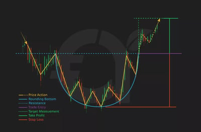
Price ActionThe Rounding Bottom pattern shows that the market has slowly transitioned from a state of declining prices to a state of recovery. The initial decline reveals bearish momentum, but as the price begins to flatten, it signals that sellers are losing power. When the price eventually starts to rise, buyers take control, confirming the reversal when the price breaks above the resistance level.
When to Buy/SellBuy Signal: The buy signal is triggered when the price breaks above the resistance level formed by the previous highs. This breakout is a clear sign that the bullish trend has begun.Sell Signal: A contrarian approach could involve selling as the price flattens out in the bottom phase, expecting a fleeting decline. However, be warned that this is a riskier move, as the pattern suggests that the market is preparing for an upward move.
Stop Loss & Take ProfitStop loss and take profit levels are critical to manage risk with the Rounding Bottom pattern.Stop Loss: Place the stop loss just below the lowest point of the pattern (the bottom of the "U"). This helps protect against any downside movement in case the breakout fails.Take Profit: The take profit target is mostly set by measuring the distance from the lowest point of the bottom to the resistance line, then projecting that distance upward from the breakout point.
Live ExampleConsider our fictional company ABC Corp. as an example of a Rounding Bottom pattern:
The price of ABC Corp. declined from $70 to $50, forming the rounding bottom. The price then moved sideways between $50 and $55 for a while before beginning its rise toward $70.The resistance was formed at $55. Once the price broke above $55, you entered a long position, setting a stop loss just below the bottom of the pattern at $50.The distance between the bottom of the "U" and the resistance was $5 ($55 - $50), so the take profit target was set at $60 ($55 + $5).
By entering a long position after the breakout above resistance and holding until the price reached $60, you would have captured a strong bullish reversal, maximizing gains from the Rounding Bottom pattern!
5. Cup and Handle Pattern
The Cup and Handle is an important pattern for newbies to understand, as it signals a bullish continuation and often leads to significant upward price movement. This pattern is formed during an uptrend and suggests a short period of consolidation before the price resumes its upward trajectory. What does it look like? The Cup and Handle pattern consists of two parts: the cup, which is a rounded "U" shape, followed by the handle, a smaller consolidation pattern that slopes downward.
Why is this pattern so important? Recognizing the Cup and Handle pattern can help you identify when a brief consolidation period in an uptrend is ending, signaling a potential buying opportunity as the price is likely to break out to the upside. For newbies, this can be a useful tool for knowing when to enter long positions and ride the next phase of the uptrend. Let’s break it down:Cup: The price declines and forms a rounded bottom, then gradually rises back to the previous high.Handle: After reaching the previous high, the price experiences a short, downward consolidation (the handle), which prepares for the breakout.The breakout occurs when the price breaks above the handle, signaling the continuation of the uptrend.
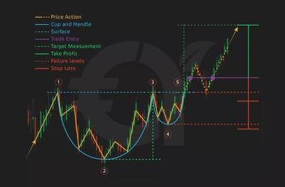
Price ActionThe Cup and Handle pattern tells you that after a pullback, buyers are stepping back in to push prices higher. The cup shows that the selling pressure is tapering off, and the handle reveals a temporary pause before the final breakout. Once the price breaks above the handle, the pattern is complete, confirming the continuation of the uptrend.
When to Buy/SellBuy Signal: The buy signal is triggered when the price breaks above the handle’s upper trendline, confirming that the uptrend is resuming. This breakout often comes with increased volume, which further validates the move.Sell Signal: Some contrarian traders might sell during the handle formation, expecting a short decline before the breakout. However, this is a riskier trade since the overall pattern is bullish.
Stop Loss & Take ProfitManaging risk with a stop loss and take profit strategy is crucial when trading the Cup and Handle pattern.Stop Loss: Place the stop loss just below the handle. This ensures you limit your losses if the breakout fails and the price reverses downward.Take Profit: The take profit target is calculated by measuring the distance between the lowest point of the cup and the resistance level at the top of the cup, then projecting that distance upward from the breakout point.
Live ExampleLet’s use Gadgets Inc. as an example of a Cup and Handle pattern:
The price of Gadgets Inc. formed a cup, dropping from $90 to $80, then gradually rising back to $90. After reaching $90, the price consolidated into a handle, pulling back slightly to $88.You entered a long position once the price broke above the $90 resistance level, setting a stop loss just below the handle at $88.The distance between the bottom of the cup and the resistance was $10 ($90 - $80), so the take profit target was set at $100 ($90 + $10).
By entering a long position after the breakout and holding until the price reached $100, you would have taken full advantage of the bullish continuation signaled by the Cup and Handle pattern!
6. Pennant Pattern
The Pennant is a critical pattern for you to recognize because it signals a continuation of the current trend, whether it’s bullish or bearish. This pattern forms after a sharp price movement and tells you that there is a fleeting period of consolidation before the price resumes its original direction. What does it look like? The Pennant is made up of a sharp move, followed by a small symmetrical triangle pattern, where the price converges within two trendlines.
Why is this pattern important? Recognizing the Pennant pattern allows you to spot moments when the market is taking a short pause before continuing its existing trend. For new investors, this pattern can signal a time to join the prevailing trend, either by entering long positions in a bullish market or short positions in a bearish one. Let’s break down the pattern:Flagpole: The strong initial price movement (upward or downward) that leads into the pennant.Pennant: A small, symmetrical triangle formed by converging trendlines, showing a temporary consolidation period.The breakout occurs when the price moves sharply in the direction of the initial trend, confirming the continuation.
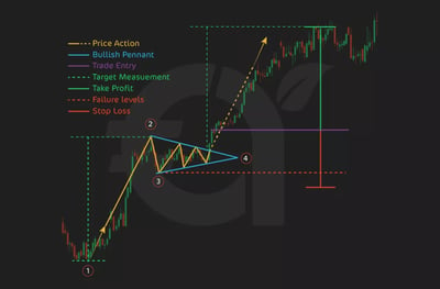
Price ActionThe Pennant pattern shows that after a healthy price move, the market pauses briefly as buyers and sellers battle for control. You should know that the prevailing trend usually resumes as one side gains strength. The key to the Pennant pattern is waiting for the breakout, which confirms whether the price will continue in the direction of the original trend.
When to Buy/SellBuy Signal (Bullish Pennant): The buy signal is triggered when the price breaks out above the upper trendline of the pennant after an upward flagpole, signaling the continuation of the bullish trend.Sell Signal (Bearish Pennant): The sell signal is triggered when the price breaks below the lower trendline of the pennant following a downward flagpole, confirming the bearish continuation.
Stop Loss & Take ProfitSetting stop loss and take profit targets is essential when trading the Pennant pattern.Stop Loss: For a bullish pennant, place the stop loss just below the lower trendline. For a bearish pennant, place the stop loss just above the upper trendline. This limits risk if the breakout fails.Take Profit: The take profit target is typically calculated by measuring the height of the flagpole (the initial sharp move) and projecting that distance in the direction of the breakout.
Live ExampleLet’s look at TechCorp Inc. as an example of a Pennant pattern:
The price of TechCorp Inc. surged from $40 to $60, forming the flagpole. After the surge, the price consolidated between $58 and $55, forming a small symmetrical pennant.Once the price broke above the upper trendline of the pennant at $58, you entered a long position, setting a stop loss just below the pennant at $55.The height of the flagpole was $20 ($60 - $40), so the take profit target was set at $78 ($58 + $20).
By entering a long position after the breakout and holding until the price reached $78, you would have made the most of the strong continuation signaled by the Pennant pattern!
7. Flag Pattern
The Flag pattern is one of the most important continuation patterns to understand as a new investor because it signals that the price is likely to continue in the direction of the prevailing trend after a short consolidation period. This pattern is characterized by a sharp price movement (the flagpole), followed by a small rectangular consolidation phase (the flag) where the price moves within two parallel trendlines.
Why is the Flag pattern important? Identifying the Flag pattern allows you to recognize fleeting pauses in a strong trend, giving you a window of opportunity to enter the market at a favorable moment before the trend resumes. Whether the trend is bullish or bearish, knowing this pattern helps you make well-timed trades. Let’s break it down:Flagpole: The sharp initial price movement, either upward (bullish flag) or downward (bearish flag).Flag: A small, rectangular consolidation period where the price moves sideways between two parallel trendlines, often slanting against the prevailing trend.The breakout occurs when the price moves sharply out of the flag in the direction of the original trend, confirming the continuation.
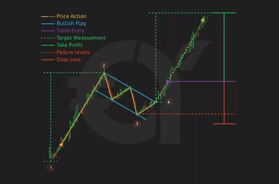
Price ActionThe Flag pattern shows that after a sharp price move, the market takes a fleeting pause. Buyers and sellers are temporarily in balance, with the price moving in a narrow range. However, the trend is still dominant, and the breakout from the flag signals that the previous trend is starting up again, whether it’s bullish or bearish.
When to Buy/SellBuy Signal (Bullish Flag): The buy signal is triggered when the price breaks above the upper trendline of the flag, confirming the continuation of the upward trend.Sell Signal (Bearish Flag): The sell signal becomes triggered when the price breaks below the lower trendline of the flag, confirming the continuation of the downward trend.
Stop Loss & Take ProfitRisk management is crucial when trading the Flag pattern, and setting stop loss and take profit levels helps you do this.Stop Loss: For a bullish flag, place the stop loss just below the lower trendline of the flag. For a bearish flag, place the stop loss just above the upper trendline. This ensures you limit losses if the breakout fails.Take Profit: The take profit target is often calculated by measuring the height of the flagpole (the initial sharp move) and projecting that distance in the direction of the breakout.
Live ExampleLet’s consider Widgets Inc. as an example of a Flag pattern:
The price of Widgets Inc. surged from $100 to $120, forming the flagpole. After the sharp rise, the price consolidated between $118 and $115, forming a rectangular flag.Once the price broke above the upper trendline of the flag at $118, you entered a long position, setting a stop loss just below the lower trendline at $115.The height of the flagpole was $20 ($120 - $100), so the take profit target was set at $138 ($118 + $20).
By entering a long position after the breakout and holding until the price reached $138, you would have hopefully made good money on the continuation of the bullish trend signaled by the Flag pattern!
8. Bearish Wedge Pattern
In my opinion, the Bearish Wedge pattern is a vital reversal or continuation pattern that every new investor should recognize because it signals a potential downward price movement. This pattern can appear in two forms: a Rising Wedge (bearish reversal) or a Falling Wedge (bearish continuation), depending on the direction of the trend before the wedge forms. The key feature of this pattern is that the price moves within two converging trendlines, indicating a narrowing trading range.
Why is this pattern important? Spotting a Bearish Wedge can help you anticipate a price decline, allowing you to position yourself for short trades or to exit long positions. For fresh market entrants, understanding this pattern can be a useful tool for identifying trend exhaustion or periods of consolidation that will lead to a bearish breakout. Here’s the scoop:Rising Wedge (Bearish Reversal): The price rises within converging trendlines, indicating that upward momentum is weakening and a bearish reversal is likely.Falling Wedge (Bearish Continuation): The price falls within converging trendlines during a downtrend, pauses, then continues its downward move.The breakout occurs when the price breaks below the lower trendline, confirming the bearish move.
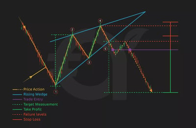
Price ActionThe Bearish Wedge pattern shows that the market is losing steam, with buyers struggling to push the price higher in a Rising Wedge or sellers pausing before driving the price further downward in a Falling Wedge. As the trendlines converge, the trading range narrows, signaling that a breakout is imminent. When the price breaks below the lower trendline, it confirms that the sellers have gained control.
When to Buy/SellSell Signal (Rising Wedge): The sell signal is triggered when the price breaks below the lower trendline, indicating a bearish reversal.Sell Signal (Falling Wedge): In the case of a bearish continuation, the sell signal occurs when the price breaks below the lower trendline, confirming that the downtrend will continue.
Stop Loss & Take ProfitUsing stop loss and take profit strategies is crucial for managing risk when trading the Bearish Wedge pattern.Stop Loss: For a Rising Wedge, place the stop loss above the upper trendline. For a Falling Wedge, place the stop loss just above the highest point of the pattern. This helps to insulate you against losses in case the breakout fails.Take Profit: The take profit target is usually set by measuring the height of the wedge at its widest point and projecting that distance downward from the breakout point.
Live ExampleLet’s look at TechStock Inc. as an example of a Bearish Rising Wedge pattern:
The price of TechStock Inc. rose from $60 to $75 but began forming a Rising Wedge as the price continued climbing between two converging trendlines. The upper trendline connected highs at $74 and $75, while the lower trendline connected lows at $68 and $70.Once the price broke below the lower trendline at $70, you climbed in on a short position, setting a stop loss just above the upper trendline at $75.The height of the wedge was $7 ($75 - $68), so the take profit target was set at $63 ($70 - $7).
By entering a short position after the breakout and holding until the price reached $63, you would have made the most of the bearish reversal signaled by the Rising Wedge pattern!
9. Bullish Wedge Pattern
The Bullish Wedge is a vital pattern for new investors because it signals a potential upward price movement. This pattern can appear as a Falling Wedge (bullish reversal) after a downtrend or a Rising Wedge (bullish continuation) during an uptrend. In both cases, the key feature is that the price moves within two converging trendlines, showing a narrowing range that suggests a breakout is imminent.
Why is the Bullish Wedge important to know? Recognizing this pattern can help you anticipate a bullish breakout, allowing you to enter long positions at a favorable point. For fresh market entrants, the Bullish Wedge is a valuable tool for spotting potential entry points when the market is consolidating before a strong upward move. Let’s break it down:Falling Wedge (Bullish Reversal): The price declines within converging trendlines, showing that selling pressure is weakening. When the price breaks above the upper trendline, it signals a reversal to the upside.Rising Wedge (Bullish Continuation): The price rises within converging trendlines, indicating a pause in the uptrend. When the price breaks above the upper trendline, the uptrend is likely to continue.The breakout occurs when the price breaks above the upper trendline, confirming the bullish move.
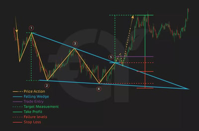
Price ActionThe Bullish Wedge pattern reflects a short-term consolidation where the market is moving from selling to buying momentum. In a Falling Wedge, sellers are losing strength as the price narrows, leading to a reversal once the price breaks above the upper trendline. In a Rising Wedge, buyers are temporarily consolidating before the price continues upward. The breakout signals that buyers have gained control, pushing the price higher.
When to Buy/SellBuy Signal (Falling Wedge): The buy signal is triggered when the price breaks above the upper trendline of the wedge, confirming the bullish reversal.Buy Signal (Rising Wedge): The buy signal is triggered when the price breaks above the upper trendline, confirming that the uptrend will continue.
Stop Loss & Take ProfitTo manage risk when trading the Bullish Wedge pattern, it's important to set proper stop loss and take profit targets.Stop Loss: For a Falling Wedge, place the stop loss just below the lowest point of the wedge. For a Rising Wedge, place the stop loss below the lower trendline. This limits potential losses in case the breakout fails.Take Profit: The take profit target is normally calculated by measuring the height of the wedge at its widest point and projecting that distance upward from the breakout point.
Live ExampleLet’s look at Widgets Inc. as an example of a Bullish Falling Wedge pattern:
Widgets Inc. had a bad quarter, and its price tumbled from $70 to $50, forming a Falling Wedge as the price moved between converging trendlines. The upper trendline connected highs at $55 and $53, while the lower trendline connected lows at $50 and $52.Once the price broke above the upper trendline at $53, you entered a long position, setting a stop loss just below the lowest point of the wedge at $50.The height of the wedge was $5 ($55 - $50), so the take profit target was set at $58 ($53 + $5).
By entering a long position after the breakout and holding until the price reached $58, you would have successfully captured the bullish reversal indicated by the Falling Wedge pattern.
10. Ascending Triangle Pattern
The Ascending Triangle is a highly reliable bullish continuation pattern that signals the potential for an upward breakout. This pattern forms during an uptrend and is characterized by a horizontal resistance line at the top and an upward-sloping trendline at the bottom. As the price consolidates within this triangle, the range narrows, and the market is preparing for a breakout to the upside.
Why is this pattern important for newbies? Recognizing the Ascending Triangle can help you identify consolidation periods during an uptrend, signaling a time to enter long positions in anticipation of the breakout. For fresh market entrants, this pattern provides a clear structure that allows for well-timed trades. Let’s break it down:Resistance Line: The upper horizontal boundary of the triangle, where the price repeatedly touches but fails to break through.Upward-Sloping Trendline: The lower boundary of the triangle, where the price forms higher lows as buyers push the price upward.The breakout occurs when the price moves decisively above the resistance line, confirming the continuation of the uptrend.
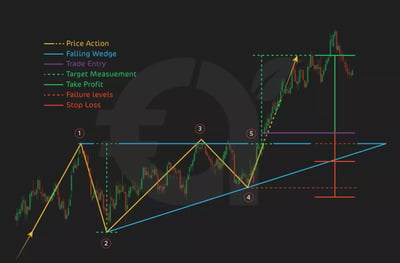
Price ActionThe Ascending Triangle pattern shows that buyers are becoming increasingly aggressive, pushing the price higher with each pullback, while sellers defend the resistance level. The narrowing price action between the upward-sloping trendline and the resistance line signals that a breakout is imminent. Once the price breaks above the resistance line, it confirms that buyers have taken control, and the uptrend is likely to continue.
When to Buy/SellBuy Signal: The buy signal is triggered when the price breaks above the resistance line, confirming the breakout. The breakout is often accompanied by increased volume, further validating the bullish continuation.Sell Signal (for contrarians): Some traders might short at the resistance level, expecting a pullback before the breakout. You should know that this is a riskier move since the pattern typically signals an impending upward breakout.
Stop Loss & Take ProfitUsing stop loss and take profit strategies is important when trading the Ascending Triangle pattern.Stop Loss: Place the stop loss just below the upward-sloping trendline to protect against a false breakout.Take Profit: The take profit target is usually calculated by measuring the height of the triangle (the vertical distance between the highest and lowest points within the triangle) and projecting that distance upward from the breakout point.
Live ExampleConsider TechCorp as an example of an Ascending Triangle pattern:
TechCorp moved within an ascending triangle, with resistance at $100 and higher lows forming along the trendline at $90, $93, and $96.Once the price broke above the $100 resistance level, you entered a long position, setting a stop loss just below the most recent low at $96.The height of the triangle was $10 ($100 - $90), so the take profit target was set at $110 ($100 + $10).
By entering a long position after the breakout and holding until the price reached $110, you would have made the most of the bullish continuation signaled by the Ascending Triangle pattern!
11. Ascending Triangle: Bullish Continuation
The Ascending Triangle is one of the most reliable bullish continuation patterns, indicating that an existing uptrend is likely to continue. It is characterized by a horizontal resistance line at the top, where the price struggles to break through, and an upward-sloping trendline at the bottom, where higher lows form as buyers gain strength. The narrowing price range suggests that pressure is building for a breakout to the upside.
Why should you know about this pattern? The Ascending Triangle helps you spot moments of consolidation within an uptrend, signaling a potential breakout and a continuation of the bullish trend. For fresh market entrants, this pattern offers a clear sign of when to enter long positions and benefit from the market’s upward momentum. Let’s break it down:Resistance Line: The price repeatedly touches a horizontal resistance level but fails to break through, indicating selling pressure.Upward-Sloping Trendline: Buyers push the price higher with each dip, forming higher lows, which suggests increasing buying pressure.The breakout occurs when the price moves above the resistance line with strong momentum, confirming that the uptrend will continue.
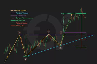
Price ActionAs you can see from the image, in an Ascending Triangle, the market moves between the resistance line and the upward-sloping trendline. As the price creates higher lows, it tells you that buyers are becoming more aggressive, but sellers are still defending the resistance. The narrowing range signals that a breakout is near. When the price finally breaks above the resistance, it suggests that buyers have overcome the selling pressure, and the uptrend resumes.
When to Buy/SellBuy Signal: The buy signal occurs when the price breaks above the resistance line, confirming the bullish continuation. Ideally, this breakout is accompanied by increased volume, which further supports the signal.Sell Signal (for contrarians): Some traders may attempt to sell at the resistance line, betting on a short-term pullback before the breakout. I will tell you that this is dangerous since the overall pattern signals that the price is more likely to break out upward.
Stop Loss & Take ProfitManaging risk is crucial when trading the Ascending Triangle pattern, and setting stop loss and take profit levels helps you do this.Stop Loss: Place the stop loss just below the upward-sloping trendline or the most recent higher low to minimize risk if the breakout fails.Take Profit: The take profit target is normally calculated by measuring the height of the triangle (the vertical distance between the highest and lowest points in the triangle) and projecting that distance upward from the breakout point.
Live ExampleConsider RetailCo stock as an example of an Ascending Triangle:
The price of RetailCo formed an ascending triangle with resistance at $80 and higher lows forming at $70, $73, and $75 along the trendline.When the price broke above the $80 resistance level, you entered a long position, setting a stop loss just below the most recent low at $75.The height of the triangle was $10 ($80 - $70), so the take profit target was set at $90 ($80 + $10).
By entering a long position after the breakout and holding until the price reached $90, you would have used the bullish continuation indicated by the Ascending Triangle pattern to your advantage.
12. Descending Triangle: Bearish Continuation
The Descending Triangle is a classic bearish continuation pattern that signals the potential for the existing downtrend to continue. It is defined by a horizontal support line at the bottom, where the price repeatedly bounces but fails to break lower, and a downward-sloping trendline at the top, where the price forms lower highs. This pattern shows that sellers are gaining strength, and buyers are struggling to hold the price at support, leading to a likely breakdown.
What’s good to know about this pattern? Identifying the Descending Triangle helps you anticipate the continuation of a downtrend, giving you the opportunity to enter short positions before the price breaks down. For first-timers, this pattern offers a clear visual guide for timing entries and capitalizing on bearish market movements. Let’s break it down:Support Line: The lower horizontal boundary where the price repeatedly finds support but struggles to push higher.Downward-Sloping Trendline: The upper boundary is formed by lower highs as sellers consistently push the price downward.The breakout occurs when the price breaks below the support line, confirming the continuation of the bearish trend.
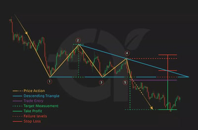
Price ActionIn a Descending Triangle, the price action reflects increasing selling pressure. The support line represents a level where buyers are holding the price, but each rally forms a lower high, showing that buyers are weakening and sellers are gaining control.
The narrowing price range between the support line and the downward-sloping trendline is a clear sign of building pressure, which is often released with a sharp breakdown below support, signaling a continuation of the downtrend.
When to Buy/SellSell Signal: The sell signal is triggered when the price breaks below the horizontal support line, confirming the bearish continuation. Ideally, the breakout should be accompanied by increased volume, confirming the strength of the downtrend.Buy Signal (for contrarians): Some contrarian traders might buy at the support level, expecting a bounce before the breakdown. However, this is a ropey strategy since the pattern strongly suggests a continuation of the bearish trend.
Stop Loss & Take ProfitSetting the ideal stop loss and take profit levels is really important for managing risk when trading the Descending Triangle pattern.Stop Loss: To minimize risk in case of a false breakout, put the stop loss just above the most recent lower high or the downward-sloping trendline.Take Profit: The take profit target is usually calculated by measuring the height of the triangle (the vertical distance between the highest and lowest points within the pattern) and projecting that distance downward from the breakout point.
Live ExampleLet’s consider TechCo stock as an example of a Descending Triangle pattern:
The price of TechCo formed a descending triangle with horizontal support at $50 and lower highs forming along the downward-sloping trendline at $60, $58, and $55.You entered a short position when the price broke below the $50 support level, setting a stop loss just above the most recent high at $55.The height of the triangle was $10 ($60 - $50), so the take profit target was set at $40 ($50 - $10).
By entering a short position after the breakout and holding until the price reached $40, you just made the most of the bearish continuation indicated by the Descending Triangle pattern.
13. Symmetrical Triangle Pattern
The Symmetrical Triangle is a versatile chart pattern that signals a period of consolidation followed by a potential breakout. This pattern can be neutral, meaning the breakout can occur in either direction—bullish or bearish—depending on market conditions. It is formed by two converging trendlines: one upward-sloping trendline that connects higher lows and one downward-sloping trendline that connects lower highs. The price movement within the triangle narrows as the range tightens, indicating that a breakout is imminent.
Why is this pattern important for investors? Recognizing the Symmetrical Triangle helps you anticipate a healthy price move, whether up or down. This pattern offers a clear structure for first-timers, allowing you to wait for a confirmed breakout and position yourself accordingly. Let’s break it down:
Upward-Sloping Trendline: The lower boundary of the triangle, where the price forms higher lows.
Downward-Sloping Trendline: The upper boundary, where the price forms lower highs.
The breakout occurs when the price moves decisively above the upper trendline (bullish breakout) or below the lower trendline (bearish breakout).
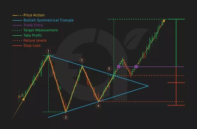
Price Action
The Symmetrical Triangle pattern reflects a state of equilibrium between buyers and sellers. The price action narrows as both sides test the market, but neither is able to take control. The tightening range signals that the market is consolidating, and when the price eventually breaks out, it often leads to a sharp movement in the direction of the breakout.
When to Buy/Sell
Buy Signal (Bullish Breakout): The buy signal is triggered when the price breaks above the upper trendline of the triangle, signaling the start of an upward move. A breakout with increased volume provides additional confirmation.
Sell Signal (Bearish Breakout): The sell signal occurs when the price breaks below the lower trendline, indicating the start of a downward move. A strong breakdown with high volume reinforces the bearish signal.
Stop Loss & Take Profit
Managing risk is key when trading the Symmetrical Triangle pattern, and setting stop loss and take profit levels helps.
Stop Loss: For a bullish breakout, place the stop loss just below the lower trendline. For a bearish breakout, place the stop loss just above the upper trendline to minimize potential losses in case of a false breakout.
Take Profit: The take profit target is typically calculated by measuring the height of the triangle (the vertical distance between the highest and lowest points within the pattern) and projecting that distance in the direction of the breakout.
14. Symmetrical Triangle: Neutral Continuation
The Symmetrical Triangle is a neutral continuation pattern that is a sign of a period of consolidation in the market before a breakout. Unlike other patterns that have a directional bias, the Symmetrical Triangle is neutral, meaning the breakout can occur in either direction—bullish or bearish. It forms when two trendlines converge: an upward-sloping trendline connects higher lows, and a downward-sloping trendline connects lower highs. As the price tightens between these two lines, it signals that a breakout is likely, but the direction is uncertain.
What should I know about this pattern? The Symmetrical Triangle gives you a heads-up that a healthy price movement is on the horizon. For new investors, this pattern allows you to prepare for a breakout in either direction and act quickly when it occurs. Let’s break it down:Upward-Sloping Trendline: This trendline forms as the price makes higher lows, reflecting increasing buying pressure.Downward-Sloping Trendline: This trendline forms as the price makes lower highs, indicating growing selling pressure.The breakout happens when the price breaks out of the triangle—either above the downward-sloping trendline (bullish breakout) or below the upward-sloping trendline (bearish breakout).
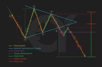
Price ActionIn the Symmetrical Triangle pattern, the price moves within a narrowing range as buyers and sellers reach a temporary equilibrium. This consolidation is a sign of indecision in the market. However, the tightening price action signals that momentum is building, and a breakout is likely to occur before the price reaches the apex of the triangle. The direction of the breakout—whether upward or downward—determines the continuation of the previous trend.
When to Buy/SellBuy Signal (Bullish Breakout): A buy signal is triggered when the price breaks above the downward-sloping trendline, confirming that the upward trend is continuing. A breakout with increased volume provides more decisive confirmation.Sell Signal (Bearish Breakout): A sell signal occurs when the price breaks below the upward-sloping trendline, signaling that the downtrend will continue. A breakdown with strong volume confirms the bearish continuation.
Stop Loss & Take ProfitSetting stop loss and take profit levels is crucial to manage risk effectively with the Symmetrical Triangle.Stop Loss: For a bullish breakout, place the stop loss just below the upward-sloping trendline. For a bearish breakout, place the stop loss just above the downward-sloping trendline to limit potential losses in case of a false breakout.Take Profit: The take profit target is commonly calculated by measuring the height of the triangle (the vertical distance between the highest and lowest points) and projecting that distance in the direction of the breakout.
Live ExampleLet’s use our stock TechCo as an example of a Symmetrical Triangle:
The price of TechCo formed a symmetrical triangle, with higher lows at $50 and $52 and lower highs at $60 and $58.When the price broke above the downward-sloping trendline at $58, you entered a long position, setting a stop loss just below the upward-sloping trendline at $52.The height of the triangle was $10 ($60 - $50), so the take profit target was set at $68 ($58 + $10).
By entering a long position after the breakout and holding until the price reached $68, you would have profited from the bullish continuation signaled by the Symmetrical Triangle pattern.
The Lesser Charts
In the next section, I will review some charts you are less likely to encounter and use while trading. It’s still good to know about them, which is why I will explain them to you, albeit in less detail.
15. Triple Top Pattern
The Triple Top is a bearish reversal pattern signaling a potential shift from an uptrend to a downtrend. It forms when the price hits a resistance level three times, creating three peaks at nearly the same price. This pattern shows that the market is struggling to sustain its upward momentum. Once the price breaks below the support level, it suggests that sellers have gained control, marking the beginning of a downtrend.
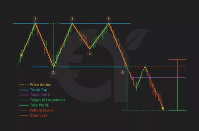
Recognizing the Triple Top is crucial, as it allows you to anticipate a bearish reversal and either exit long positions or enter short positions. The pattern consists of three peaks, each failing to breach the resistance level, showing that buyers are losing strength. When the price breaks below the neckline, it confirms the bearish reversal, often accompanied by increased selling volume. Traders typically place stop losses just above the third peak to manage risk, while the take-profit target is calculated by measuring the distance from the highest peak to the neckline and projecting it downward from the breakout point.
16. Triple Bottom Pattern
The Triple Bottom is a bullish reversal pattern that signals a potential shift from a downtrend to an uptrend. It forms when the price hits a support level three times without breaking below it, creating three distinct troughs at a similar price level. This pattern suggests that selling pressure is waning and buyers are gaining control. The bullish reversal is confirmed when the price breaks above the resistance level, often leading to a robust upward price movement.
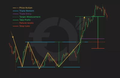
Recognizing the Triple Bottom is vital as it reveals a weakening downtrend and the potential for a rally. The pattern consists of three troughs, each rebounding from the same support level, showing that sellers can’t push the price lower. The breakout above the neckline confirms the shift in momentum, typically accompanied by increased buying volume. Traders usually set stop losses just below the third trough to manage risk and calculate the take profit target by measuring the distance from the troughs to the neckline, projecting this distance upward from the breakout point.
Both the Triple Top and Triple Bottom patterns are reliable reversal patterns that provide you with clear signals for entering short or long positions, respectively. By waiting for the breakout, setting appropriate stop losses, and calculating profit targets based on the height of the pattern, you can best manage risk and capitalize on these opportunities. The Triple Top signals the end of an uptrend, while the Triple Bottom signals the end of a downtrend.
17. Bullish Rectangle Pattern
In my experience, the Bullish Rectangle is a continuation pattern that occurs during an uptrend, indicating a temporary pause before the price continues to rise. It features two parallel horizontal lines, with the price oscillating between a resistance line at the top and a support line at the bottom. This pattern signifies a balance between buyers and sellers, but the breakout usually occurs to the upside, resuming the original uptrend.
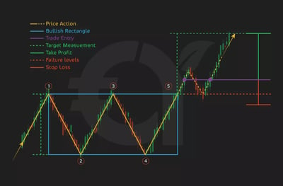
The Bullish Rectangle reveals periods of consolidation within an uptrend and signals potential entry points. You can identify the pattern from its repeated bounces between resistance and support levels, reflecting a market equilibrium. The breakout happens when the price moves above the resistance line, indicating the continuation of the bullish trend. Traders often place stop losses just below the support line to manage risk, while the take-profit target is determined by measuring the rectangle's height and projecting this distance upward from the breakout point.
18. Diamond Top Pattern
The Diamond Top is a bearish reversal pattern that signals a potential shift from an uptrend to a downtrend. Formed after a strong upward move, this pattern features a broadening phase with higher highs and lower lows, followed by a contracting phase with lower highs and higher lows, creating a diamond shape on the chart. It indicates that buying momentum is fading, and when the price breaks below a key support level, it confirms that sellers have taken control, marking the start of a downtrend.
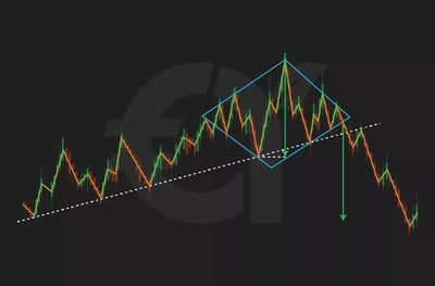
Recognizing the Diamond Top gives you an early signal to exit long positions or enter short positions before the price declines. During the broadening phase, volatility rises as buyers and sellers struggle for dominance. As the price range narrows, it shows consolidation and weakening upward momentum. The sell signal occurs when the price breaks below the support level at the diamond's base, often with increased selling volume. Traders typically set stop losses just above the upper edge of the diamond to manage risk.
19. Diamond Bottom Pattern
The Diamond Bottom is a bullish reversal pattern that suggests a potential shift from a downtrend to an uptrend. This pattern forms after a significant price decline and consists of an initial broadening phase, where the price makes lower lows and higher highs, followed by a contracting phase that creates a diamond shape on the chart. It signals that selling pressure is diminishing, and when the price breaks above a critical resistance level, it confirms that buyers are gaining control, marking the start of an uptrend.
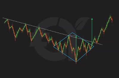
Watching this develop gives you an early indication of a bullish reversal, allowing you to enter long positions before the price rallies. During the broadening phase, market volatility is high as sellers dominate, but buyers start to push back. As the price contracts, it points toward market stabilization and weakening seller strength. A buy signal occurs when the price breaks above the resistance level at the diamond's top, typically accompanied by increased buying volume. To manage risk, traders place stop losses just below the diamond's lowest point and set a take profit target by measuring the height of the diamond and projecting that distance upward from the breakout point.
Both Diamond Top and Diamond Bottom patterns are rare but powerful reversal patterns that provide you with clear signals for entering short or long positions.
20. Pipe Top and Pipe Bottom Patterns
The Pipe Top Pattern is a bearish reversal pattern that signals a potential shift from an uptrend to a downtrend. It forms after a significant price rise, featuring two or more candlesticks with nearly identical highs, resembling a "pipe" on the chart. This pattern indicates that buying pressure is weakening and sellers are gaining control. The reversal is confirmed when the price breaks below a key support level, marking the start of a downtrend.
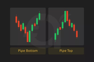
Once you can identify the Pipe top, you can enter short positions before a decline. During the formation phase, the price hits a peak and struggles to rise further, showing fading buying momentum. The sell signal occurs when the price breaks below the support level, often with increased selling volume. To best manage your risk, place a stop loss just above the highest point of the pipes and setting a take profit target by measuring the height between the pipes and projecting that distance downward from the breakdown point.
The Pipe Bottom Pattern is a bullish reversal pattern that signals a potential shift from a downtrend to an uptrend. It forms after a significant decline, characterized by two or more candlesticks with nearly identical lows, creating a "pipe" shape on the chart. This pattern suggests that selling pressure is waning and buyers are taking control. The reversal is confirmed when the price breaks above a key resistance level, signaling the start of an uptrend.
A buy signal is triggered when the price breaks above the resistance level with increased buying volume. Traders typically place a stop loss just below the lowest point of the pipes and determine the take profit target by measuring the height between the pipes and projecting that distance upward from the breakout point.
The Pipe Top and Pipe Bottom patterns are effective reversal patterns that help traders identify rapid shifts in market sentiment.
21. Island Reversal Pattern
From what I've seen as a trader, the Island Reversal Pattern is a rare yet powerful reversal pattern that signals a potential shift in market direction, from bullish to bearish or vice versa. It forms when a cluster of prices is isolated on the chart, separated by gaps on either side, creating an "island" of price action. This pattern indicates a sharp shift in market sentiment, suggesting that the previous trend is ending. The reversal is confirmed when the price gaps in the opposite direction, leaving the isolated price action behind.
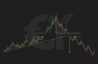
A buy signal appears when an Island Bottom forms after a downtrend, with the price gapping up, while a sell signal happens when an Island Top forms after an uptrend, with the price gapping down. Traders should place stop losses just below the island for bullish reversals or above it for bearish reversals; set take profit targets based on the height of the gap.
The Island Reversal is a highly reliable pattern because of its clear visual formation and the quick nature of the price gaps. For investors like you, it provides a straightforward entry point for trades following a confirmed breakout, with defined risk management strategies.
22. Symmetrical Triangle Pattern
The Symmetrical Triangle Pattern is a continuation pattern that indicates a potential breakout in the direction of the prevailing trend. It forms when the price consolidates between two converging trendlines: one sloping downward (resistance) and the other sloping upward (support). As the price narrows within this triangle, it builds pressure, often leading to a strong breakout. However, be aware that the pattern does not predict the direction of the breakout; it merely suggests that a significant move is likely once the pattern is complete.
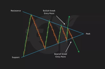
Identifying this pattern will alert you to a period of consolidation, allowing you to prepare for a hefty price move in either direction. During the consolidation phase, the price fluctuates within the converging trendlines, showing a market in equilibrium. As the pattern progresses, the tightening range signals building pressure.
When the price breaks above the resistance line, this is usually a buying signal, as it confirms a bullish breakout. A sell signal occurs when the price drops below the support line, indicating a bearish breakout. Place stop losses just outside the opposite side of the triangle.
Do Chart Patterns Really Work?
There is no magic wand in any form of financial investing. Chart patterns can be effective tools for traders when used correctly, but their success largely depends on market conditions, the trader's experience, and the integration of additional analysis methods.
These patterns simply reveal the collective market psychology and the behavior of buyers and sellers. They work on the principle that historical price movements and patterns tend to repeat due to the consistent nature of human behavior in trading decisions.
When a chart pattern forms, it signals a potential change or continuation in the trend, providing traders with potential entry and exit points. Be sure to increase the reliability of these pattern increases by combining them with other technical analysis tools like volume indicators, moving averages, and support and resistance levels.
Chart patterns are not foolproof and do not guarantee success despite their usefulness. Markets are influenced by many factors, including economic data releases, geopolitical events, and market sentiment, which can cause price movements that deviate from historical patterns.
False breakouts, where the price appears to move out of a pattern but then reverses direction, can lead to losses if not managed carefully. We’ll talk more about this in a later section.
How Can I Use Chart Patterns in Technical Analysis?
Chart patterns are fundamental tools in technical analysis used to predict future price movements by analyzing historical market behavior. They provide traders with visual representations of price action, highlighting key areas where trends may continue or reverse.
One of the main benefits of using chart patterns in technical analysis is that they help you manage risk more effectively, which is not to be sneezed at. Each pattern typically has well-defined parameters for setting stop-loss orders and take-profit targets. For instance, in a triangle pattern, the breakout point clearly indicates where to enter a trade, while the pattern's height can be used to estimate the potential price target. This structured approach helps traders limit potential losses and maximize gains.
Why Do Chart Patterns Work?
In my view, chart patterns work because they are visual representations of the ongoing battle between supply and demand in markets, reflecting traders' psychology and behavior. As I’ve said, each pattern tells a story about the interactions between buyers (demand) and sellers (supply), showing how their decisions shape price movements.
For example, in a double-top pattern, the price reaches a peak, indicating strong demand, but then fails to break higher on a second attempt. This failure signals buying pressure weakening, and sellers (bears) are gaining control. As bullish traders recognize the market's inability to sustain higher prices, they may switch their positions from buy to sell, adding to the selling pressure and driving prices lower. This transition marks a shift in market sentiment from bullish to bearish, and the pattern provides a visual cue for traders to act accordingly.
Never forget that chart patterns work not because they predict the future, but because they capture market participants' recurring behaviors and reactions. Markets are driven by fear, greed, and perceptions of value, and chart patterns reflect these emotional responses visually.
What are False and Failed Breakouts?
If there’s one thing we need to warn you about, it’s false breakouts. A false breakout occurs when the price of an asset moves beyond a key support or resistance level, suggesting a potential new trend, but then quickly reverses direction and returns to its previous range.
This phenomenon often traps traders who enter positions in anticipation of the breakout's continuation, only to see the price move against them. False breakouts can occur in either direction—above resistance or below support.
For example, in an upward false breakout, the price may move above a resistance line, drawing in bullish traders, but then rapidly fall back below that resistance level. This typically occurs due to a lack of sustained buying momentum or significant selling pressure at the new price level. Recognizing a false breakout is crucial for traders, as it can prevent losses and reduce the risk of entering trades on false signals.
A failed breakout is similar but usually refers to a breakout that initially succeeds and shows promise of continuing the trend but ultimately fails to sustain the new price movement. In this case, the price may break through a support or resistance level with a strong move, possibly accompanied by high volume, indicating a legitimate breakout.
However, the momentum fades after some time, and the price reverses back into the prior range. For example, a failed breakout from a consolidation pattern, like a triangle, may initially show a strong move in the expected direction, but if buyers or sellers do not follow through with enough force, the price can fall back into the triangle. Failed breakouts highlight the importance of confirmation and managing trades carefully, as they can result in swift reversals and catch you off guard
Which Timeframe is Best to Use Trading Chart Patterns?
The best timeframe for trading chart patterns depends on your style, strategy, and the market you are trading. However, commonly used timeframes range from short-term, such as 5-minute to 1-hour charts, to longer-term, like daily or weekly charts.
Short-Term Timeframes (5-Minute to 1-Hour Charts): These are ideal for day traders and scalpers seeking to capitalize on quick price movements within a trading day. Patterns like flags, pennants, and triangles can form and complete relatively quickly on these charts. The advantage of using short-term timeframes is that they provide more frequent trading opportunities. However, due to the influence of short-term volatility and less significant price movements, they are also more susceptible to market noise and false breakouts.
Medium-Term Timeframes (4-Hour to Daily Charts): Swing traders often prefer these timeframes as they provide a balance between trading frequency and pattern reliability. Patterns on 4-hour or daily charts, such as head-and-shoulders, double tops/bottoms, and triangles, tend to be more reliable because they reflect more significant market movements and sentiment shifts. Trades based on these timeframes usually last several days to weeks, allowing traders to capture more significant price movements with potentially higher accuracy and fewer false signals.
Long-Term Timeframes (Daily to Weekly Charts): Long-term investors and position traders typically use daily, weekly, or monthly charts to identify major chart patterns, such as cup-and-handle, long-term triangles, and rounding bottoms. Patterns on these timeframes represent broader market trends and are generally more reliable because they account for a larger volume of data and encompass more market participants. However, the trade-off is fewer trading opportunities and longer holding periods, sometimes months to years.
Overall, medium-term timeframes (4-hour to daily charts) are often considered the best compromise for most traders, offering a good balance between the frequency of trading opportunities and the reliability of chart patterns. However, the ideal timeframe varies depending on individual trading goals, risk tolerance, and market conditions.
Conclusion
In my experience as a longtime trader, chart patterns are powerful tools that offer a window into market psychology, helping traders anticipate potential price movements with confidence. By recognizing patterns such as pennants, head-and-shoulders, double tops, and triangles, you can unlock valuable insights into market trends and turning points. Remember, while these patterns can increase the probability of successful trades, they are not guarantees. Markets can be unpredictable, and patterns are not always foolproof. Use them as part of a broader strategy, incorporating other technical indicators and sound risk management practices. And always keep in mind—this article is not financial advice. Stay informed, stay prepared, and let chart patterns be one of many arrows in your trading quiver.
FAQ
Chart patterns are visual formations created by the price movements of an asset. They help traders identify potential trend changes, allowing them to anticipate future price movements based on historical data.
Chart patterns provide insights into market psychology, highlighting the balance of supply and demand. Recognizing these patterns helps traders identify potential entry and exit points, improving their trading strategies.
Continuation patterns signal that the current trend is likely to continue after a brief pause, while reversal patterns indicate a potential change in the trend's direction.
While chart patterns can offer a high probability of success, they are not foolproof. They reflect historical market behavior and require confirmation from other technical indicators to reduce the risk of false signals.
A Pennant is a continuation pattern that forms when the price consolidates between two converging trendlines. Traders use it to identify potential entry points when the price breaks out of the pattern with momentum.
The Head and Shoulders pattern is a bearish reversal pattern that suggests a potential end to an uptrend. It comprises three peaks, with the middle peak being the highest. The pattern completes when the price breaks below the support level.
A Double Top pattern forms after an uptrend and features two peaks at similar levels. It indicates that buying pressure is weakening, and a bearish reversal may occur if the price breaks below the support level.
The Cup and Handle is a bullish continuation pattern that suggests the market may resume its upward trend after a brief consolidation period. The pattern completes when the price breaks above the resistance formed by the "handle."
The Ascending Triangle is a bullish continuation pattern where the price moves between a horizontal resistance line and an upward-sloping support line. A breakout above the resistance line signals a potential upward move.
A False Breakout occurs when the price moves beyond a support or resistance level, suggesting a new trend, but quickly reverses back. Traders can avoid false breakouts by waiting for confirmation, such as increased volume, before entering trades.
Volume is crucial in confirming chart patterns. For example, a breakout with high volume suggests strong market interest, making the pattern more reliable. Conversely, a breakout on low volume may indicate a false move.
The Island Reversal is a rare reversal pattern that signals a sharp change in market direction. It forms when a cluster of price movements is isolated on the chart, separated by gaps on either side, indicating a swift shift in sentiment.
Traders set stop losses based on key levels in the pattern, such as below support for bullish patterns or above resistance for bearish patterns. This helps limit potential losses if the trade moves against them.
Yes, chart patterns can be used on various timeframes. However, patterns on higher timeframes (daily, weekly) are generally more reliable, while those on shorter timeframes (5-minute, 15-minute) may produce more false signals.
Chart patterns should be used alongside other technical indicators like moving averages, RSI, and MACD to improve accuracy. Combining multiple tools helps filter out false signals and strengthen trading decisions


